

Expenses
The Expenses widget displays the total amount of expenses for the month. The diagram shows the ratio of expenses by category. The widget displays 5 categories with the highest expenses. The remaining categories are summed up in Other categories.
💡 If expenses in the app are created without a category, they will be displayed in the No category.
Click on the Report button to open a detailed expense section. Here you can select a report: Summary, Categories, Brands. In each report, graphs of the ratio of the total amount of expenses to the month/year are generated.
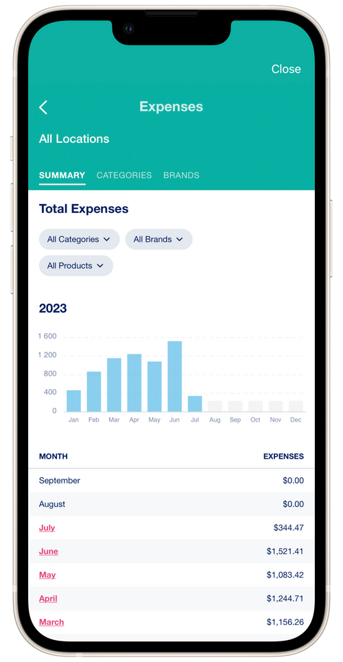
Summary
Section titled “Summary”The summary report shows the total amount of expenses for each year by month. Click on the name of the month to view detailed expenses by month.
Categories and Brands
Section titled “Categories and Brands”The Categories and Brands reports show the total amount of expenses for the month. These reports also show the number of expenses for each category and for each brand. You can switch the display of data by year and by month.
💡 Clicking on a category or brand opens a detailed list of expenses. The average amount of expenses per category/brand is displayed above the table.